AVIS
Personal redesign of the main italian blood donation association app to boost blood donations through a clearer navigation.
AVIS
Personal redesign of the main italian blood donation association app to boost blood donations through a clearer navigation.

AVIS
Personal redesign of the main italian blood donation association app to boost blood donations through a clearer navigation.

AVIS
Personal redesign of the main italian blood donation association app to boost blood donations through a clearer navigation.

MY ROLE
UX/UI designer
TOOLS


PROJECT TYPE
Personal project
YEAR
2025-2026
MY ROLE
UX/UI designer
TOOLS


PROJECT TYPE
Personal project
YEAR
2025-2026
MY ROLE
UX/UI designer
TOOLS


PROJECT TYPE
Personal project
YEAR
2025-2026
MY ROLE
UX/UI designer
TOOLS


PROJECT TYPE
Personal project
YEAR
2025-2026
Problem
AVIS' app doesn't have a clear navigation, nor a notification system to remind users to donate blood. This and other usability issues might limit the number of blood donations, reducing AVIS' beneficial impact.
Solution
My redesign is aimed at enhancing the navigation and assist users to donate as many times as possible to gather more blood.
✅ Clearer navigation
✅ Clearer gamification
✅ More donations expected
#
1
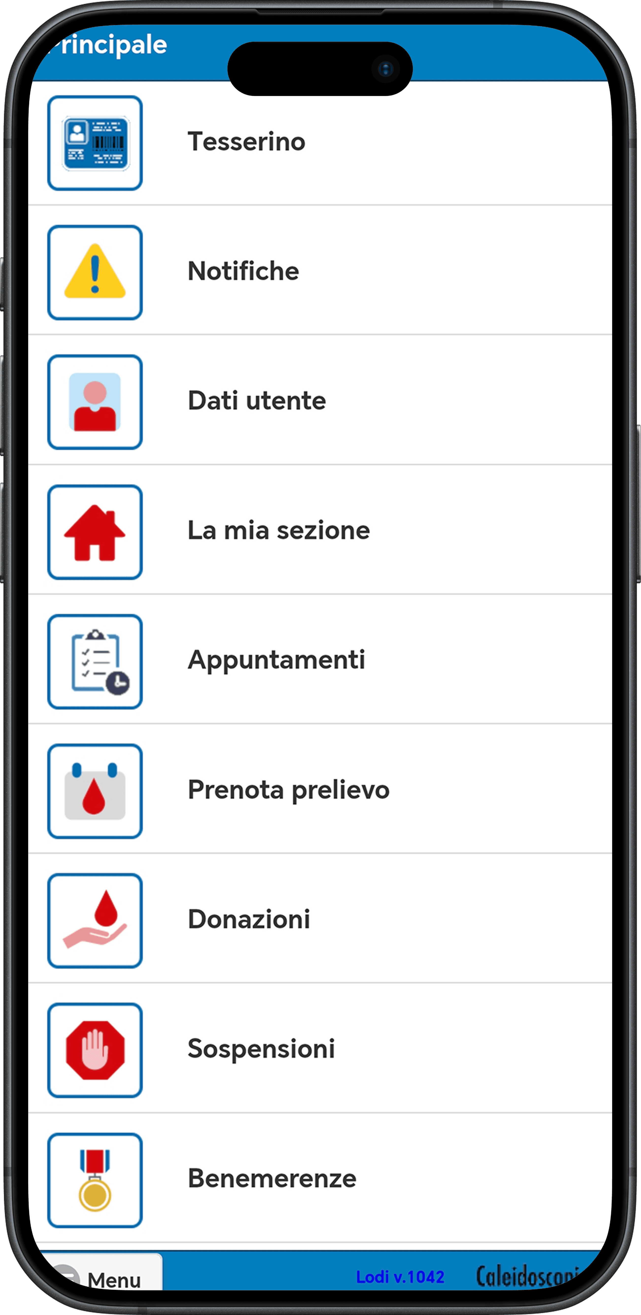
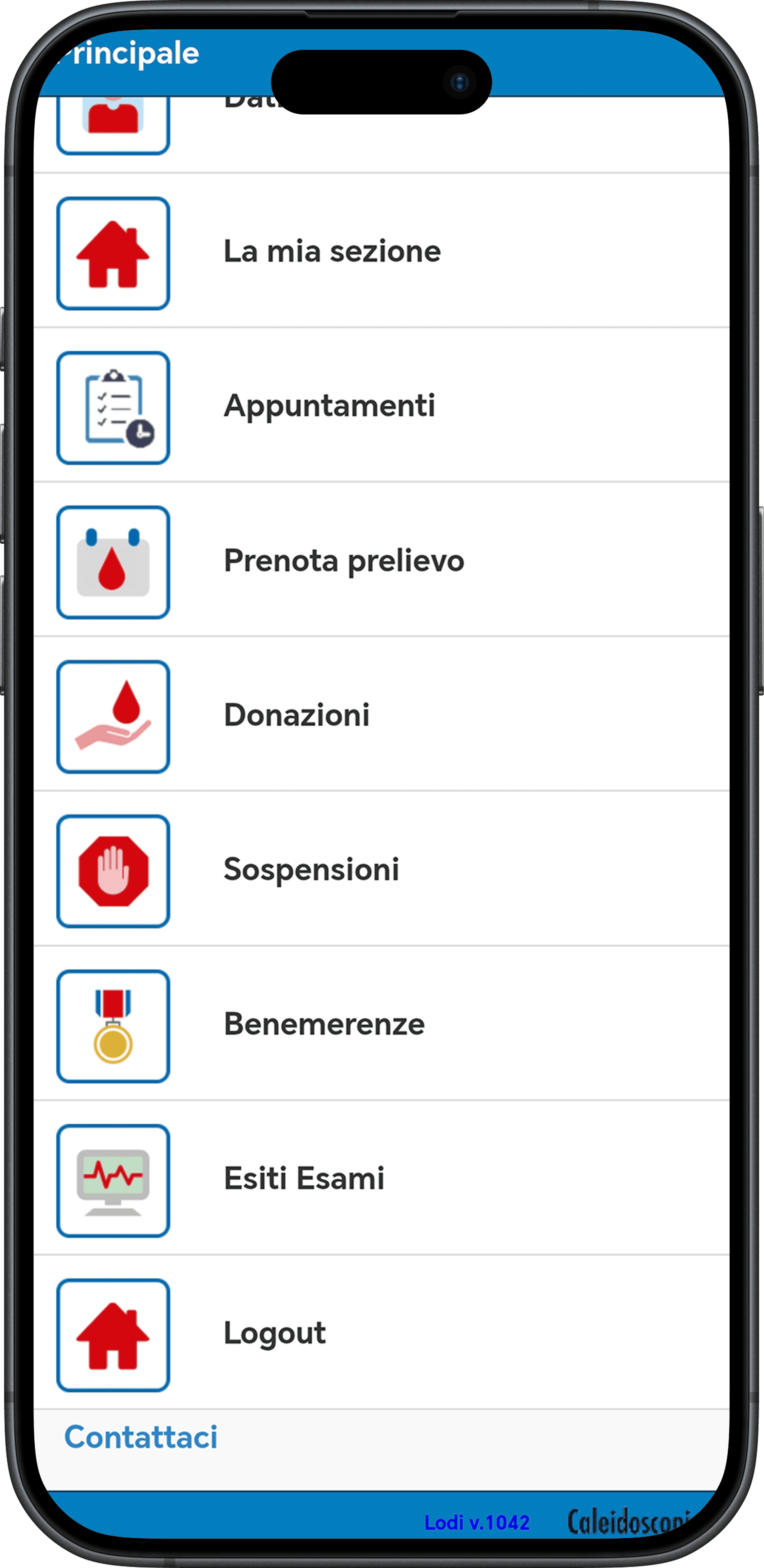
At first, I thought it was just an issue of usability
While booking a donation, I thought of redesigning the interface because I had a hard time simply navigating through the app.
A heuristic evaluation didn't show big usability issues except from strange spacing. But an unnecessary complexity accompanies many actions.


#
2
Diving deeper, I discovered that navigation is limiting the association potential
Through a survey, I discovered that 70% (!) of my respondents had no idea that booking a donation through the app was even possible.
Now, I don't have the reach power of a marketing research firm, but these 57 answers are shouting that there's a problem.

#
3
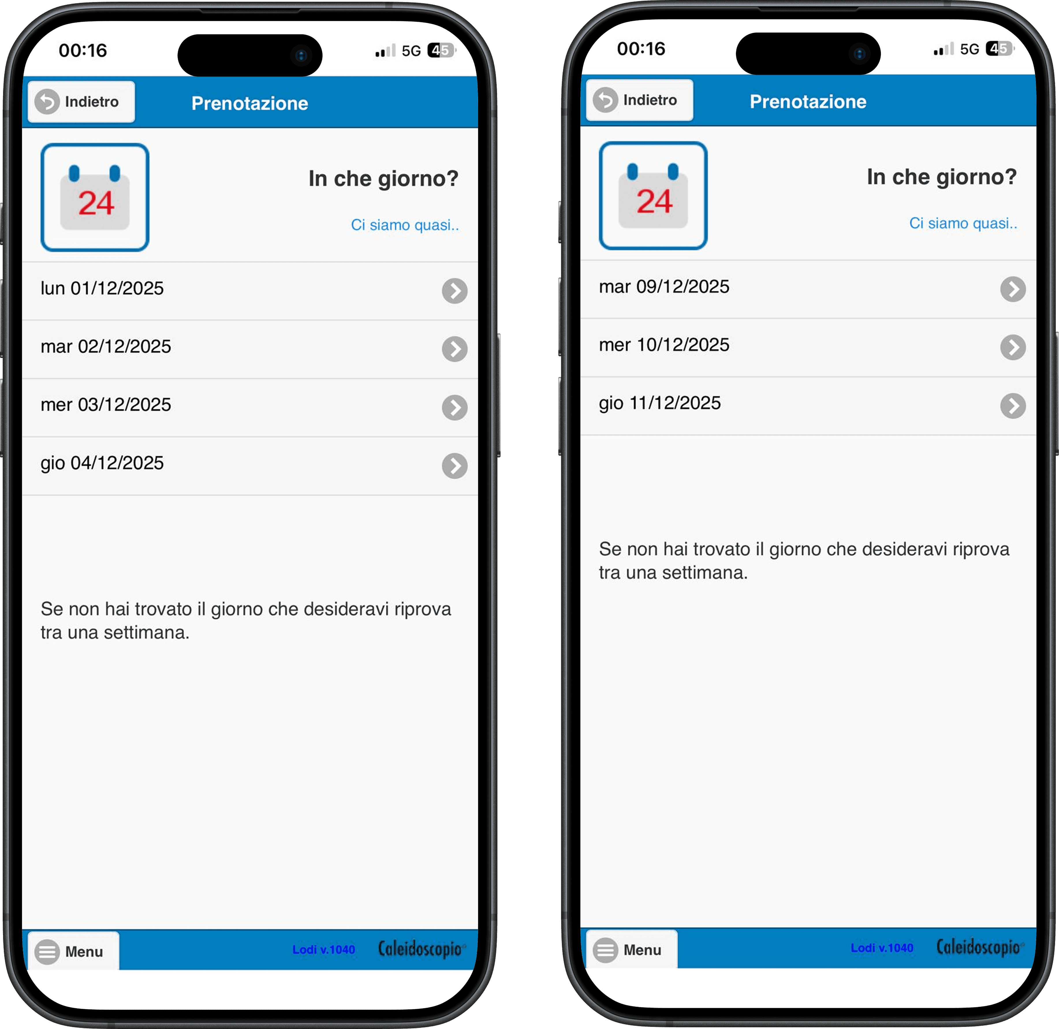
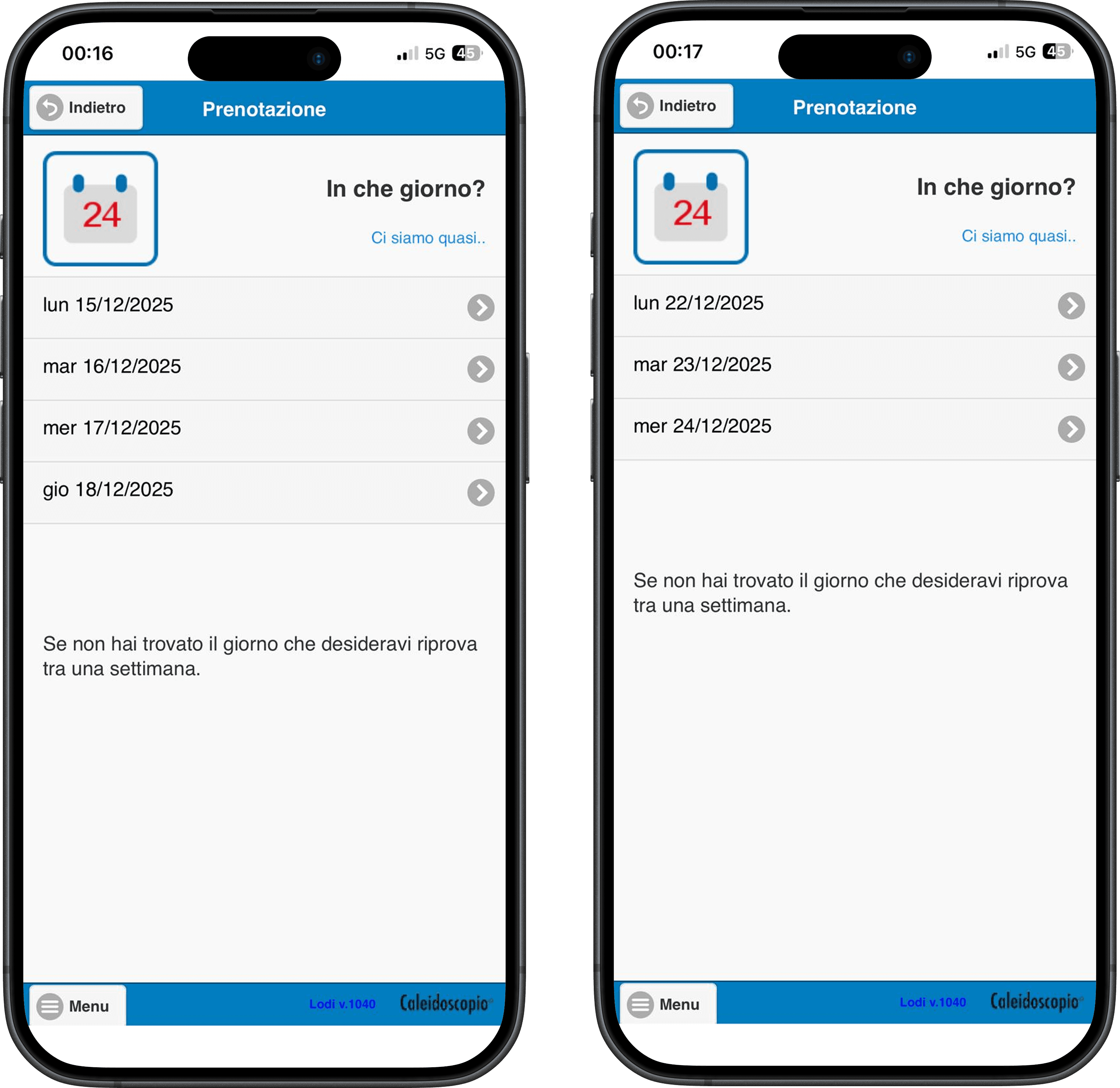
Besides, respondents say that they donate because they think it's socially useful, but many donate on fridays...
When booking a donation, my brother showed me that fridays were unavailable for the following two months. The reason is pretty simple: when donating blood, italian law exempts you from work the whole day.
Hence, in redesigning the app, I kept in mind two user personas: Pietro, a selfless donor who does it for the community, and Laura, a selfish one. The point isn't judging, but rather understanding what are the key drivers to boost donations for both type of users.


#
4
Hence, the whole redesign is aimed at boosting donations, starting from a clearer navigation
Users can easily switch between the 4 main pages through a classic navigation bar.
This way, everything is more discoverable. For instance, users can istantly find their exams' results (they will also be notified).

#
5
Users can book a donation directly from the home
As the whole point of the app is donating blood or plasma, the first thing users will see when opening the app is a box with two booking options. Users can choose between blood and plasma,with an indication of which one is more requested at the moment.
They could also choose to set up a notification so that they remember to book a donation when becoming eligible once again.


#
6
To maximise the donations of the more selfish donors, I'd make their lives easier
Since some users donate to avoid work, it would be nice to digitalize the donation certificate that is now a paper sheet. If it was sent by email, it could be directly forwarded to users' work responsibles.
Besides, every past donation would have a dedicated digital certificate if needed.


#
7
How to measure the intended impact?
The first step is going to be user testing, to assess the efficacy of the new navigation system.
Next, if my solution was implemented, I would look at the conversion rate. How will the number of donations vary after this implementation?
#
7
How to measure the intended impact?
The first step is going to be user testing, to assess the efficacy of the new navigation system.
Next, if my solution was implemented, I would look at the conversion rate. How will the number of donations vary after this implementation?
#
7
How to measure the intended impact?
The first step is going to be user testing, to assess the efficacy of the new navigation system.
Next, if my solution was implemented, I would look at the conversion rate. How will the number of donations vary after this implementation?
#
8
Bonus: some inspiration I got from GenAI
Based on the insights from research, I created a prompt with indication on visual style, information architecture, and content.
I've then prompted several AI tools to explore lots of visual ideas faster and to accelerate the prototyping phase.
#
8
Bonus: some inspiration I got from GenAI
Based on the insights from research, I created a prompt with indication on visual style, information architecture, and content.
I've then prompted several AI tools to explore lots of visual ideas faster and to accelerate the prototyping phase.
#
8
Bonus: some inspiration I got from GenAI
Based on the insights from research, I created a prompt with indication on visual style, information architecture, and content.
I've then prompted several AI tools to explore lots of visual ideas faster and to accelerate the prototyping phase.


AI tools I've explored with
Other projects you might be interested in
Other projects you might be interested in
Other projects you might be interested in
Other projects you might be interested in
Got anything in mind?
Got anything in mind?
Table of contents


